
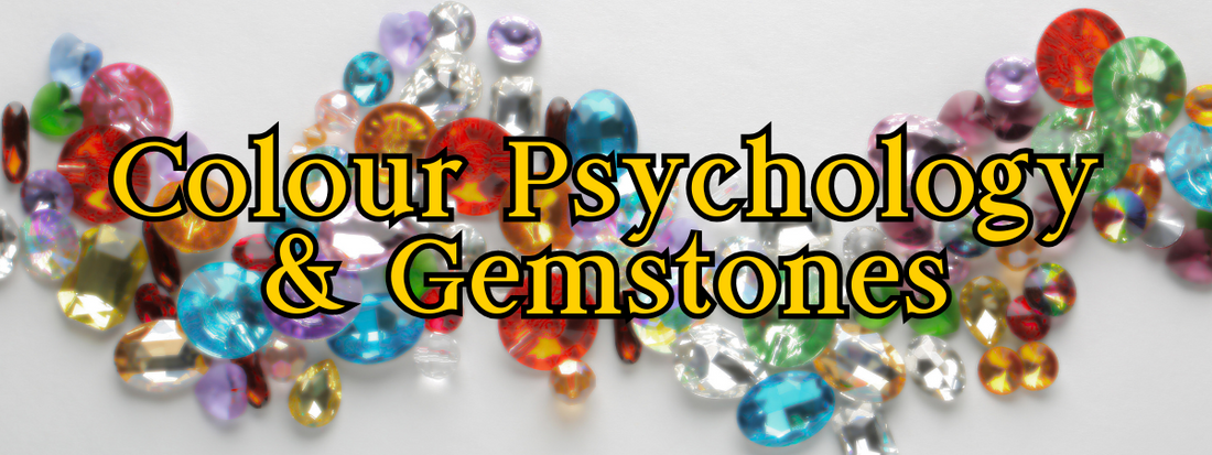
Colour Psychology and Gemstones: A Bright Idea for Jewellery Design
Have you ever found yourself drawn to a gemstone and not quite known why? Maybe it was the warmth of a golden citrine or the calm of an aquamarine. Chances are, colour psychology had a part to play.
This is the first post in a new series I'm writing that will be exploring how colour affects our emotions, and how that connects with the colourful world of gemstones. Whether you’re a jeweller, collector, or curious enthusiast, understanding colour psychology can add a whole new layer of meaning to your designs and purchases!
 What Is Colour Psychology?
Colour psychology looks at how colours influence our mood, thoughts, and behaviour. For example, red is often linked with warnings (there's a reason why red is generally one of the first colours given a name within a language system) as well as passion and power, while green is associated with nature, balance and renewal.
These ideas aren’t just woo-woo either. While colour responses can be personal and cultural, there’s a growing body of research exploring how colour impacts everything from marketing to wellbeing.
In short: colour feels like something. And those feelings matter, especially when you’re working with something as emotionally expressive as jewellery.
 How Colour Psychology Applies to Gemstones
When we talk about colour in gemstones, we’re talking about more than surface-level style. Each gem brings its own unique hue, and with it, a distinct emotional tone.
Think of a rich violet amethyst. It might evoke mystery or spirituality. A sunny yellow sapphire? Confidence and joy. These emotional associations can be incredibly powerful, and in some cases even dictate the success of failure of a design!
 Why This Matters in Jewellery Design
Jewellery isn’t just an accessory, it’s a form of self-expression. Colour plays a huge role in that. When you understand what different colours communicate, you can design pieces that speak to your clients on a deeper level.
Want a piece that makes someone feel calm and centred? Cool-toned gems like blue topaz or green aventurine might be a perfect choice. Creating a bold statement piece? You might reach for red garnet or vibrant orange fire opal.
You can design with intention, whether that’s to uplift, soothe, empower, or energise.
 Colour Psychology in Marketing and Descriptions
Describing a gemstone's colour is already part of what you do, but what if you could take that a step further?
Colour psychology gives you a way to add emotion and meaning to your product descriptions, in a way that can directly appeal to your target customer. Instead of just saying a stone is “deep green,” you might describe it as “a grounding forest green, evoking calm, connection, and growth.”
This isn’t about adding fluff, it’s about helping your customer connect with your creation. It can also help your marketing stand out in a crowded space. People buy jewellery based on how the piece makes them feel after all, not because of the technical specifications of it.
 Cultural Influences on Colour Meaning
While some colour associations seem universal, others can shift depending on cultural context. White, for example, symbolises purity in many Western traditions, but in some Eastern cultures, it’s associated with mourning.
If you're designing for a diverse audience, or selling internationally, it’s worth being mindful of these cultural variations. The colour that means “celebration” to one person might carry a very different meaning for someone else.
It’s not about getting it “right”, just about being thoughtful and aware.
 Personal Associations and Intuition
Alongside broader symbolism, colours can spark deeply personal memories and feelings. Maybe someone loves yellow because it reminds them of a childhood summer. Or avoids green because it was their school uniform colour.
These emotional associations are just as valid as anything from a psychology textbook. Trusting your intuition, and encouraging your customers to do the same, can lead to truly meaningful jewellery choices.

Colour Harmony and Emotional Pairings
Sometimes, it’s not just about one colour, it’s about how colours interact. A bold red paired with crisp white feels very different to red with gold or black. These colour combinations can subtly shift the emotion of a piece.
Thinking in colour pairs (or trios) is especially useful when designing with multiple gemstones or planning full collections. A cool-toned blue-green mix might feel calming and oceanic. A pink and orange pairing? Bright, playful, and full of joy.
Future posts in this series will look more closely at how to use these pairings to enhance emotional impact.
 Science side note - How We See Colour in Gemstones
Here’s a fun science bonus for you!
If you crush down a gemstone, most of them will become a white power. This is because most types of gems don't get there colour from a pigment within the stone. Instead, the colour we see comes from a process called selective absorption.
White light contains all the colours of the spectrum. When that light enters a gemstone, certain wavelengths get absorbed by its atomic structure. The colour we see is all the rest of the wavelengths of light that weren't absorbed as they are the ones that get reflected back to our eyes.
So when you admire a velvety blue sapphire, what you're actually seeing is the light it didn't keep!

Light, Environment, and Perception
A quick but important note: gemstone colour can shift under different lighting conditions. Natural daylight, warm indoor bulbs, and even smartphone screens can all change how a stone appears.
This matters not just when choosing a gemstone, but also when photographing or marketing it. Letting your customers know how a gem looks in various lights builds trust, and helps avoid disappointment!
 Colour Psychology vs. Metaphysical Meanings
If you're already familiar with gemstone metaphysics, you might be wondering how colour psychology fits in. While there’s some overlap, they’re not quite the same.
Metaphysical meanings are more spiritual or energetic, often rooted in ancient legends and crystal healing traditions. Colour psychology, on the other hand, is more about emotional response and psychological research.
You don’t have to pick one or the other! Many jewellers use both to connect with customers on multiple levels.
 Bringing It All Together
Colour psychology adds another tool to your jewellery making kit. It’s not just about what looks good, it’s about what feels good. And for your customers, that can be the difference between liking a piece and loving it.
As we continue this series, we’ll explore individual colours and their emotional associations in more depth. From passionate reds to peaceful blues, and even some metallic tones, you’ll get insights that can help you design, describe, and connect more powerfully.